 This time I want to introduce you with Matan Eshel a very talented proffesional Photographer from Israel, mainly photographing landscape,portraits and fashion photography. You can see some of his beauty work in his online gallery – Matan Eshel Photography .
Matan writes here on his view on creating 3D view in photography, so please read and comment below for further questions or i
In our everyday life we see the world in 3 dimensions Height, Width and Depth. But unlike in reality pictures are 2 dimensional, the lack the 3rd and arguably the most important dimension, Depth.
Adding Depth to an picture can be done with a very basic but very complex tool… Light.
Light can give your picture Depth both figuratively and physically. Technically a picture is light. Or rather a picture is light captured on by your camera weather its digital or film.
Lighting in 3D, or more correctly Lighting the 3rd dimension, what we will be talking about, It doesn’t matter how you light it, weather its Natural lighting, Studio Lighting or like what I’m will be using “Strobist Lighting”.
For those of you who are unfamiliar with concept of being “Strobist”. It’s using your run-of-the-mill flash off camera, and in that seemingly simple action, a whole new world of creative lighting is opens up to you. For those of you who want to learn the basis I suggest you read David Hobbie’s, Blog, Strobist.Com. It’s excellent! And if you are gonna learn this stuff, learning it from the guy who practically invented it, is the way to go.
But time to get Down N’ Dirty and start talking about 3D lighting.
So how do we take a picture, that while has only 2 dimensions feels realistic and that has depth?
Like we said before Light, or the Lack of light. Lighting an Object in a specific way and creating shadows or just areas which are less lit can give us that depth.
I’ll show you how each photo was made, but I’m going to focus on the Idea of “lighting in 3D” and less about the technical aspect because there are people, like David Hobby that explain far better than me.
So let’s get to the first picture,
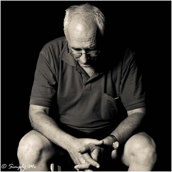
Now aside from the Black/White conversion I didn’t do any Photoshop to the picture.
This very serious looking man is in fact my Dad, whom took a few quick shots of for an article I wrote at the time but it’s very relevant to us here, why?
Take a close look at the picture, now it might have different issues with it, but what I want you to focus here is on the light and the lack of light in different parts of the picture. See how shadows created giving the sense of texture? it is the lack of light in the some parts of the photo. Such as the shirt, the shadow to the side of right on the head, the shadows in his forehead. Those elements help you define depth in a 2 dimensional photo. Now let’s jump over real quick to the technical side, the set-up is rather simple a reflective Umbrella located to the left tilted down towards my subject.
Here is a picture:
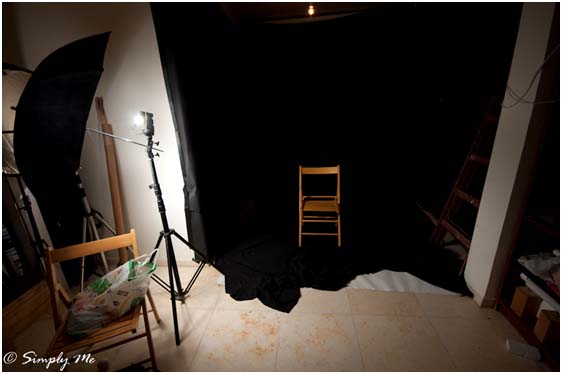
Ok, so let’s break it down why did I place the lighting there? Approximately 45 degrees from the subject (it’s a bit warped I shot the set-up with a Super-wide angel lens). Placing the light at an angle to my subject, and not with On-Camera Flash allows me to move freely without having to worry about the lighting. But the main point here is that placing the flash at an angle allows me to create shadows and the harsh light on my subject. Placing light at different angles weather it’s sideways or Up/Down can and in most cases will change the whole picture. it will also Make or Break a picture.
Since I wanted to give my Dad a certain look, a harsh, very serious look I chose to use strong shadows that would show off his “Personal texture”.
What did you Use?
I used a Nikon SB 28 with a radio transmitter (Cactus V4 to be exact) as my light source and placed it on a light stand. The Flash was pointed into a reflective Umbrella. What is a Reflective Umbrella?
Quiet Simply, Exactly what it says, the internal Part of the umbrella is reflective and bounces light back, it helps you control where the light is going to hit. it also makes your light source bigger.
If you are unfamiliar with them I suggest you read about them on link I gave you at the beginning, there is a whole article dedicated to them.
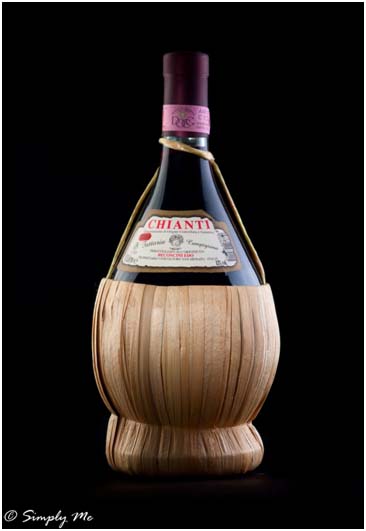
But let’s take it a few notches up, and get more a little more technical to help understand the idea behind all of this. Here we won’t just be using shadows to define an object, but also use different “Levels” of light. What do I mean by “Levels”? Levels refer to the intensity of the light as it falls onto the object. In this picture you will see how the light falls differently on different parts of the object. This picture has a much more complex set up but the idea is the same to use light to define an object.
It’s not easy but take a few moments and try to see if you can reverse engineer the picture, reflections are normally the best way. You look long enough and try to analyze it you can see that it isn’t a single light source. But the idea here was that shadows and the and different levels of light would help me define the bottle and give it a feeling of depth. By the way has been Photoshoped but no changes to the lighting were made mostly contrast, cleanup and color. And the picture isn’t a hidden ad, it’s just to prove a point 🙂
As you get better and more familiar with lighting reverse engineering photos will be easier and will help you better understand how a picture was made. It’s also a good way to practice your lighting, a good website I highly recommend is Strobox.com , it’s a community site where people not only share their photos but how the made the photo, how the light was positioned, it helps a lot.
Anyway back to the picture of the wine bottle…
Figured it out yet? Don’t feel bad if you didn’t like I said it’s rather complex…
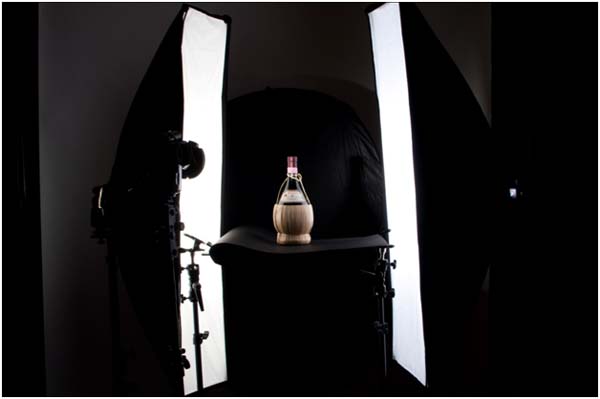
Here is a picture of the set up
First the Gear that i used:
- backdrop – a reflector turned to its black side to used to as a background
- Front Light – A Nikon SB 26 with Rogue Honey-comb on it to focus and to light the label
- Back Light – 2 Nikon SB 28’s with Laccolite Hotrod Strip Softbox
- Base – Simple black cardboard that you can buy anywhere with a sheet of plastic to give it some additional strength.This is a 3 light set up, I’ll break it down to 2 parts:
- “Carving in light” – shaping
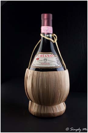
The first part are 2 of my most trusted flashes, Nikon SB 28’s in long softboxes (Lastolite Striplights) , positioned at both sides of the bottle slightly to the back (I’ll explain why in a bit why they are position to the back). Those lights are designed to define the outlines of the bottle, take a look at the picture again, see those 2 white strips at the sides of the bottle? Those are the 2 flashes in softboxes on either side, here is a photo just using those 2 lights 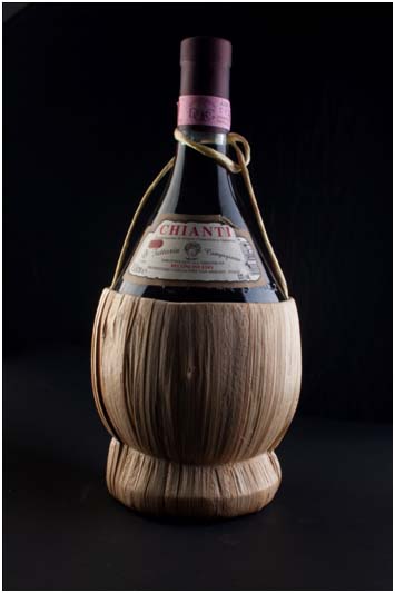
See how the sides of the bottle are well lit and yet how the center of the bottle is getting less light?, that is exactly is why I positioned the Flashes slightly to the back.
For those of you Unfamiliar with softboxes, they are pretty much the same Idea as the reflective umbrella but just another step Forward. They increase the size of your light source and allow you control just as the ordinary reflective umbrella but to a much greater degree, they are considered a must for every studio photographer.
Back to the picture at hand, I wanted define the edges but without getting too much light on the center, because I wanted to center to be at “A higher level” then the sides so the label will be clearly visible.
- “The Punch” – the key light
Now it’s time to light the key element of the picture, which in this case is the label of the wine, I used a 3rd flash using a Honey-Comb (Or Grid) which is used to focus the light in a round pattern to light. Honey-Combs/Grids are part of Constrictive Lighting – Limiting and controlling you light with great precision. In this Case I used a Rogue Honey-Comb which is a wonderful little product I was asked to try out. The flash here is quiet close to the bottle to get as accurate as I could but without the Honey-Comb it would have blasted the whole bottle, and that would defeat the whole point of this exercise. As I said before the honey-comb limits the light and also shape it in a round pattern the center of the bottle. The honey-comb was set to 16 Degrees -When using Grids or honey-Combs you will often see a degree number that specifies exactly at how constrictive it is. O.K after that not-so-short explanation let’s see what we got.
here is the final result
The front flash adds another level of light and defines the label
The Honey-Comb restricts the light from going to places we don’t want it to go.
What I want to say here is whether its multiple light sources or a single light source, can help you create different levels of light, shadows and tell whole stories just with light.
Always keep in mind when you are shooting with artificial lighting (whether it’s in an environment with or without natural light), where your lighting is in regards to you subject, if it’s a person moving around or an object, because it is that light that will define your subject and will help you express yourself in the picture.
Anyway I hope you enjoyed this piece…

